

Introduction:
DataList control in asp.net has RepeatDirection, RepeatColumns and RepeatLayout properties, which are unique for DataList control. These properties are useful when you need to create presentation with more than one record per row, like Image Gallery, Product Catalogue etc. For example, let say you are creating an image gallery and want to show 5 images per row. Repeater would require checking of record position and manipulating HTML. With DataList, just use RepeatDirection=”Horizontal” and RepeatColumns=”5″. RepeatLayout could be Table or Flow, depending of do you need HTML table structure in layout. These features are not possible using any other data controls.
The DataList control like the Repeater control is a template driven, light weight control, and acts as a container of repeated data items. The templates in this control are used to define the data that it will contain. It is flexible in the sense that you can easily customize the display of one or more records that are displayed in the control.
The DataList Web server control displays data in a format that you can define using templates and styles. The DataList control is useful for data in any repeating structure, such as a table. The DataList control can display rows in different layouts, such as ordering them in columns or rows.
This comes in handy, especially in situations where you have too many columns in your database table or columns with larger widths of data. As an example, imagine what would happen if there is a field called Address in our Employee table having data of large size and you are displaying the data using a Repeater, a DataGrid, or a GridView control. You will not be able to display columns of such large data sizes with any of these controls as the display would look awkward. This is where the DataList control fits in.
When the web page is in execution with the data bound to it using the Page_Load event, the data in the DataList control is rendered as DataListItem objects, that is, each item displayed is actually a DataListItem. Similar to the Repeater control, the DataList control supports Editing and Deleting features whereas Repeater does not support. The DataList control does not have Paging and Sorting functionalities built into it similar to Repeater control.
How to use the DataList control
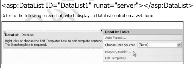
To use the DataList control, you first need to add it to your ASP.NET page. You can do this by dragging the DataList control from the Toolbox onto the page.
Once the DataList control is added to the page, you need to bind it to a data source. To do this, set the DataSource property of the DataList control to the data source that you want to use.
Next, you need to define the template that will be used to display the data. The DataList control provides a number of different templates that you can use, such as the ItemTemplate, HeaderTemplate, and FooterTemplate.
The ItemTemplate is used to display each item in the data source. The HeaderTemplate is used to display a header above the data. The FooterTemplate is used to display a footer below the data.
To define a template, simply add the template markup inside the tags of the template that you want to use. For example, to define the ItemTemplate, you would add the markup inside the <ItemTemplate> and </ItemTemplate> tags
Propertiesof the DataList control :-
CssClass: It enables us to associate a CSS class with the DataList.
HeaderStyle: It enables us to format the header row of the DataList.
FooterStyle: It enables us to format the footer row of the DataList.
ItemStyle: It enables us to format each row displayed by the DataList.
AlternatingItemStyle: It enables us to format every other row of the DataList.
EditItemStyle: It enables us to format the DataList row selected for editing.
SelectedItemStyle: It enables us to format the selected row in the DataList.
SeparatorStyle: It enables us to format the row separator displayed by the DataList.
When formatting the DataList, we also need to work with the following properties:
GridLines: It enables us to add rules around the cells in the DataList. Possible values are None, Horizontal, Vertical, and Both.
ShowFooter: It enables us to show or hide the footer row.
ShowHeader: It enables us to show or hide the header row.
UseAccessibleHeader: It enables us to render HTML <th> tags instead of <td> tags for the cells in the header row.
FAQ
Q: What is the difference between the DataList control and the Repeater control?
A: The DataList control and the Repeater control are both data-bound controls that can be used to display data in a variety of ways. However, the DataList control offers more flexibility and control over the layout of the displayed data.
For example, the DataList control allows you to define templates for the header, footer, and individual items in the data list. The Repeater control does not allow you to define these templates.
Q: When should I use the DataList control?
A: You should use the DataList control when you need to display data in a variety of ways and you need to have control over the layout of the displayed data.
For example, you might use the DataList control to display a list of products in a table, with a header and footer. Or, you might use the DataList control to display a list of products in a flow layout, with each product displayed on its own line.
Q: How do I use the AlternatingItemStyle and ItemStyle properties?
To use the AlternatingItemStyle and ItemStyle properties, simply set the property to a style object.
You can also use the AlternatingItemStyle and ItemStyle properties to set different style properties for different types of items in the data list. For example, you could set a different style for selected items, or for items that are in an error state.
You can also use CSS to style the DataList control and its items. To do this, simply add the appropriate CSS classes to the DataList control and its items.